
Refactoring my personal website, Part 1: The design
2022-08-18
- Dev-Blog
- Personal-website
- Frontend
After initially creating a personal website as a small side project over a year ago, I had decided expand the project and add some more functionality to it, in particular the capability for blogging.
In the first part of this blog series, I will explain how I approached completely overhauling the website's design.
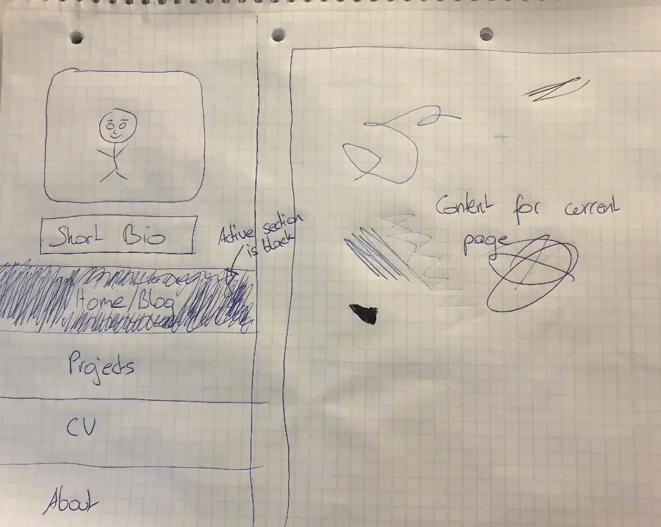
Sketching and initial setup
The initial design I had in mind for the new look of the website was a split view look. A big advantage of structuring the website in this way is that it makes the sections of the website easily exchangeable or expandable, because the content side of the website is a largely unconstrained, blank slate for every section that is added or updated.
To realize this, I heavily relied on the use of flexbox, both for the split screen view and the actual structure of the content itsself.
First, to ensure that the body size always matches the window size the following setup is used:
body {
    display: flex;
    flex-flow: column;

    height: 100%;
    margin: 0;
    padding: 0;
}

#container {
    flex: 1 1 auto;
}
This sets the flex-grow and flex-shrink properties to 1,
because of this andflex-basis being set to auto the container will grow
and shrink to fill the entire window.
Vertical split view: navigation and content
Next, to set up the split view, the container for the two views has to be set to
display: flex; and the flex attribute has to be correctly set up
in the two child views.
#container {
    /* Override parent flex behaviour to get
    splitscreen behavior for navigation and content */
    display: flex;
    flex-flow: row;

    /* Used for making the page fill the entire screen */
    flex: 1 1 auto;
}

#overflowContainer {
    /* Content set to atleast 65% of the split screen view */
    flex: 1 1 65%;
}

#navContainer {
    /* Navigation set to 35% of the split screen view.
    Will not grow */
    flex: 0 1 35%;
}
Fixing content overflow issues
Right now, content that does not fit into the content view will break the design,
as the nav and the content are both coupled to each other. Thus, if the content overflows,
the #navContainer will grow with the #overflowContainer, leading
to a distorted navigation.
To amend this the actual #contentContainer is wrapped by an #overflowContainer
with the following configuration.
#overflowContainer {
    /* Content set to 65% of the split screen view */
    flex: 1 1 65%;
}

#contentContainer {
    position: fixed;
    top: 0;
    height: 100%;
    overflow-y: scroll;
}
The #contentContainer is now anchored at a fixed position and will capture any overflowing content
by enabling
scrolling on the page. This means that the #overflowContainer can no longer overflow, as content
overflow
already being handled by its child node.
Thus, #navContainer and #overflowContainer have
successfully been decoupled and the navigation no longer breaks when content overflows.
Styling the scrollbar
For some finishing touches, the scrollbar is being styled to fit in seamlessy with the rest of the website. Note that at the time of writing, the setup for Firefox and Chrome, Edge, Safari and Opera differs, as the latter do not yet support the standard CSS attributes for customizing scrollbars.
#contentContainer {
    position: fixed;
    top: 0;
    height: 100%;
    overflow-y: scroll;

    /* CSS attributes for Firefox */
    scrollbar-color: black #fcf9f6;
    scrollbar-width: thin;
}

/* Pseudoelements for Chrome, Edge, Safari and Opera */
*::-webkit-scrollbar {
    width: .75rem;
}

*::-webkit-scrollbar-track {
    background: #fcf9f6;
}

*::-webkit-scrollbar-thumb {
    background-color: black;
    border-radius: 1rem;
    border: 2px solid #fcf9f6;
}
The result of this setup is the website on which you are currently reading this blogpost.
Conclusion
Utilizing flexbox is an extremely versatile way of rapidly designing and building appealing websites. However, it requires a through understanding of what is going on under the hood, as there are quite a few tricky to solve bugs that can occur when dealing with flexbox, some of which you now know how to solve.
If you found this post interesting or helpful, check out the next post in this series "Refactoring my personal website Part 2: Code syntax highlighting"
Share article via